
Children’s Healthcare put clear information at the centre of its campaign.
Campaign idea, modular content system and tone of voice.
Atlanta’s children’s hospital system, talking to parents at the most complicated moment of their lives.
A campaign idea, a modular content approach, and a tone that is neither cold nor complicated.
The idea
Life is complicated.
The campaign’s promise was to make complex information simpler for parents. The idea gave the content a job: help people understand the care being offered.

The approach
Modular information, at the pace of a busy life.
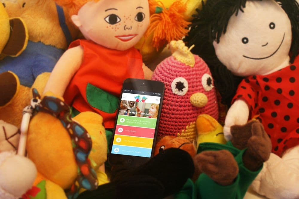
Medical information was organised into modules, giving parents a quick overview at a pace that fit their lives. The proposed content system put a straightforward explanation ahead of a complicated one.




The tone
Direct, yet caring. Neither cold nor complicated.
The tone was described in the campaign copy as “direct, yet caring” and “neither cold nor complicated.” That was the standard for each information module.